
How often do you head online using your desktop/laptop versus your mobile device? We bet that ratio is increasingly growing in favour of your mobile device! And you aren’t alone, which is why to remain competitive on search engine results pages, modern businesses must ensure their websites are mobile responsive and SEO friendly.
Simply put, mobile SEO is following best practice measures to ensure your website performs optimally on a mobile device, leaving users with an improved experience. With 76% of consumers now shopping online via a mobile device, without introducing a responsive design and proper mobile SEO friendly tactics, you can hinder your overall performance on search engine results pages, as well as a perception of professionalism.
Here are some helpful tips to ensure you are doing everything right with your mobile SEO.
Understanding Your Mobile SEO Starting Position
To understand changes needed, you first need to get an appreciation of how mobile-friendly your site actually is. This doesn’t mean manually reviewing every single page on your website – fortunately, Google provides a free, mobile-friendliness tool that can do this for you. Or, Google Search Console can provide you with more insights thanks to its Mobile Usability Report. Together, these tools will conduct a proper analysis to provide you with insights on the performance of your website.
Enhance the Load Time of Your Website
Modern users have been conditioned to expect fast, if not instant results from their online usage. If your website has a slower load time than your competitors, it will likely be a big criticism with your site visitors, and Google knows it. To prevent visitors from bouncing off after only a few seconds on your landing page, ensure your load speed is up to scratch – Google’s PageSpeed Insights tool can help you get started. You will learn what issues are causing the delays alongside remedies to speed things up! A bit of coding may be required to modify your site, but any SEO specialist worth their salt should be able to handle this for you.
Develop a Responsive Site Design
When built on a desktop, many new website have consideration for only desktops, which is a big mistake. A responsive design ensures you website can adapt to benefit a user on any device, whether it be a laptop, smartphone, or tablet. This enables better navigation of your site, scrolling through pages without issue, viewing content as it was intended, and continuing a user experience that follows a seamless journey through your digital platforms.
Bring User Experience to the Forefront of Your Development
Speaking of user experience, Google’s algorithms are set-up to promote sites that manage to keep people on pages for longer (as this would indicate they are engaged and having a positive experience with the material). A focus on overall user experience will not only draw in new visitors but keep them interacting with your website and its engaging features. This includes:
- Thumb-friendly layouts: establishing a layout that is simple for a mobile user to scroll through with their thumb, uninterrupted
- Clear CTAs: Call to actions (CTAs) are the gentle nudges you pepper throughout your content to encourage certain pages. With careful design and clever placement, this can structure a journey appealing directly to your users, taking them through a course of related content and perhaps even ending with a conversion
- Legible font: Despite phones and tablets continuing to grow in size, they are still considerably smaller than desktops, meaning if the font of your content isn’t large enough or in a clear font, users won’t waste their time squinting to read it
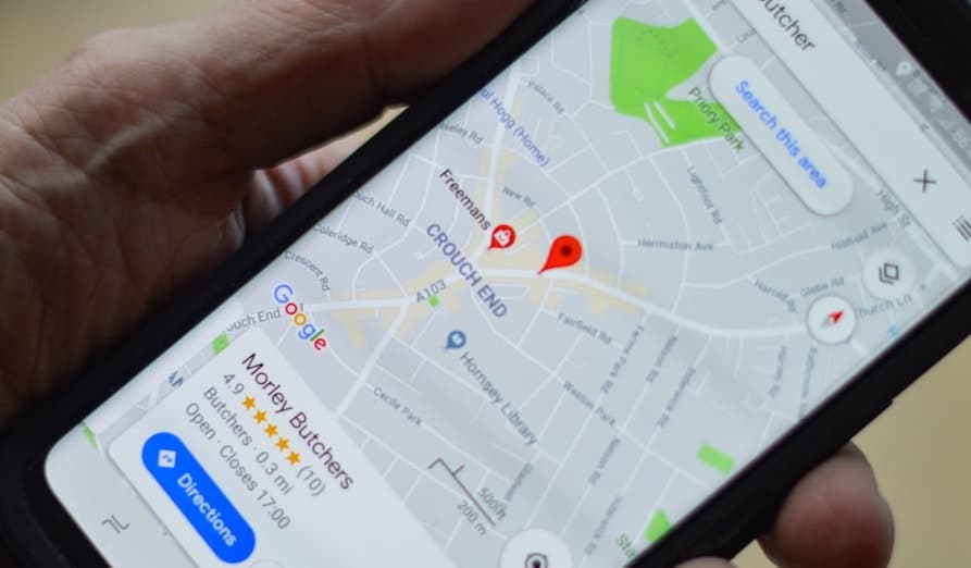
Local Optimisation
Search engine users are expecting more tailored experiences, especially in regard to ‘local’ searches. For example, search engine queries including ‘near me’ has increased by a factor of three over recent years, demonstrating the importance of local SEO. By including local keywords in your content, you can begin to establish a foothold in capturing this mobile traffic. This could be something as simple as ‘Emergency Plumbers Available in South Melbourne’. A clear message of the service and location – exactly what the potential customer is looking for.
Mobile-Curated Content
If you have ever tried to read a lengthy posts or article on your phone, you will know why this is important. Users don’t have the same space available as on desktops to digest your content, so keep things punchy with short, 2-3 sentence paragraphs. Break things up with sharp, engaging imagery and videos to take some strain off the eyes and activate other areas of the brain. You can even try to introduce more interactive elements, such as clickable buttons, for a more mobile-curated experience on your site.